Studio Queues Team · Last updated September 17, 2026
Learn how to create an effective artist commission page that converts inquiries into bookings. Focus on clarity, structure, and reader needs.
An artist commission page is the last thing someone reads before deciding whether to hire you. They have seen the art, they are interested, and now they are checking whether this is going to be straightforward. Most pages fail that check, not because they are badly written but because they were written from the artist's point of view rather than the reader's.
The common version opens with a paragraph about the artist's journey, mentions somewhere in the middle that commissions may be available, and never quite says what anything costs or how long it takes. This covers how to structure the page around the questions a buyer actually has, and how to write it so those answers are unmistakable.
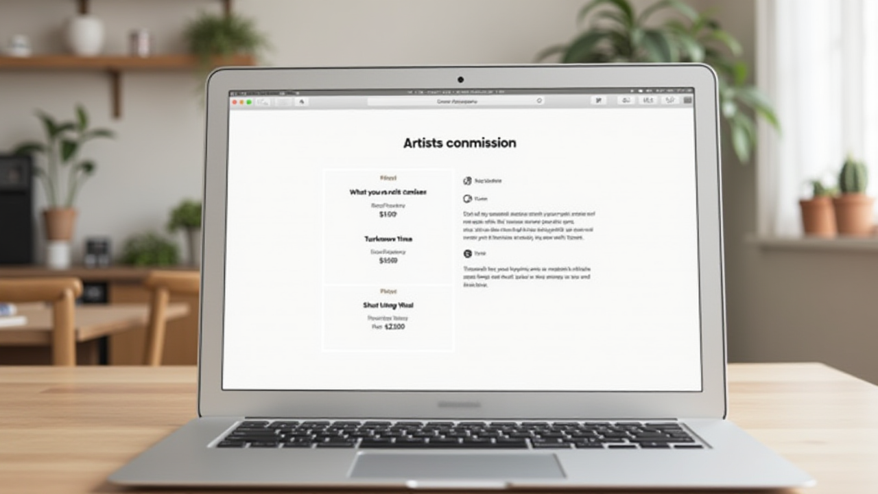
Organize an artist commission page around the reader's questions in the order they arrive: what you make, what it costs, how long it takes, whether you are open, and how to start. Write in active voice and present tense so commitments are concrete rather than vague. Keep the bio short and put it after the practical information, not before. Make the page real text rather than an uploaded image, because text can be resized, read aloud, translated, and indexed. And build it so it can be updated, since the fastest way to lose a buyer is an availability line that has been wrong for four months.
It has one job: let someone decide to hire you without needing to ask you anything first.
That framing settles most layout arguments. Anything that helps a reader decide belongs near the top. Anything that is about you rather than about their decision goes lower, or goes elsewhere. The Bureau of Labor Statistics notes that developing an online presence is often an important part of art sales, and this page is where that presence either converts or stalls.
The federal plain language guidance is unusually useful here, and it was written for an entirely different purpose, which is part of why it cuts through.
Digital.gov states that the first rule of plain language is to write for your audience, using language your audience understands and taking their existing level of knowledge and interest into account. It also addresses the common assumption that plain language means dumbing content down, which it does not.
The Office of Personnel Management's guidance puts the structural version plainly: consider who your readers are, consider what they need and want to know, and organize the content to answer their questions. It lists the qualities that characterize plain language as everyday words, personal pronouns, active voice, logical organization, and readable design features such as bullets and tables.
One caveat worth stating, since it is obvious. These standards govern federal agency writing, where personality is not the goal. Your artist commission page should sound like you. Use the guidance for structure and clarity, not as an instruction to write like a form.
Reorganize the page to match the sequence in a buyer's head, which is almost never the sequence artists use.
What do you make? Named offerings with examples. Not "illustrations" but the actual list: character illustrations, reference sheets, emotes, whatever it is.
What does it cost? Prices, visible, near the top. This is the question most likely to end the visit if unanswered, and burying it does not delay the question, it just loses the reader.
How long does it take? A realistic range. Buyers commissioning gifts are working to a date and will leave if they cannot tell whether you can meet it.
Are you open right now? Current status, stated plainly.
How does this work? Your process in a few lines. What you need from them, how payment is split, how many revisions are included, how it gets delivered.
What will you not do? A short list. This prevents inquiries you would decline and reassures buyers whose request is unusual.
Who are you? The bio, last, brief.
How do I start? One clear action.
Two mechanical changes make an artist commission page read as more trustworthy, and both come straight from the federal plain language guidance.
Active voice, because it makes clear who is supposed to do what and removes ambiguity about responsibility. "Commissions are delivered within two weeks" hides the person doing the delivering. "I deliver within two weeks" is a commitment with someone attached to it. Buyers reading passive constructions register vagueness even when they cannot name why.
Present tense, because the guidance notes that present tense is more immediate and less complicated, and that conditional or future tense makes the audience work harder to understand your meaning. "I would usually be able to start within a week" is a hedge. "I start within a week" is information.
Artists hedge on this page more than anywhere else, usually out of a reasonable fear of overpromising. The fix is to state accurate commitments plainly rather than to state vague ones softly. If turnaround genuinely varies, write the range in present tense.
Keep it short and put it after the practical information.
The bio's job is not to establish that you are an interesting person. It is to establish that you are a real, contactable, competent one. Three to five sentences covering what you draw, how long you have been doing it, anything genuinely differentiating, and where else you exist online.
What earns its place: specifics that reduce a buyer's risk. Years of experience, notable categories of work, the fact that you work with clients regularly. What does not: the story of first picking up a pencil, a list of every software package you own, or a paragraph of self-deprecation. That last one is common and actively costs you, because a buyer about to spend money reads uncertainty as risk.
Write it in first person. It is your page.
Artists frequently build the whole thing as an uploaded image, which is a commission sheet by another name and carries the same three problems.
The W3C's guidance on images of text notes that genuine text is much more flexible than images, since it can be resized without losing clarity and its colors can be adjusted to suit a reader's preferences, while images distort and pixelate when resized. Text in an image is also invisible to screen readers unless the alt text repeats it word for word.
And it does not rank. Google's image documentation explains that it understands an image through page content, captions, filenames, and alt text rather than through the pixels themselves. Your prices, written inside a JPEG, are not text that can be found.
Real text on a page also translates automatically, which matters more than most artists expect once international clients start arriving.
The most common failure of an otherwise good page is that it is out of date. Prices went up in March and the page says otherwise. The status line says open and the queue has been full since spring.
This is worse than having no page, because a buyer who acts on wrong information arrives with expectations you now have to correct, and that conversation starts the relationship on a disagreement.
Which is why availability should live somewhere designed to change. A Studio Queues profile holds each offering with its price, an estimated turnaround, a monthly slot limit, the intake questions you require, and how payment splits across milestones, and it reflects current availability rather than whatever was true when you last edited a page by hand. The bio and the personality stay yours. The details that expire live somewhere that updates.
The static counterpart is covered in how to make a commission sheet, including why a sheet works for a feed but not as a destination.
How long should an artist commission page be? Long enough to answer the questions above and no longer. If a section does not help someone decide, it belongs elsewhere.
Should I put prices on the page or ask people to inquire? Put them on the page. Requiring an inquiry to learn prices filters out buyers who were unsure they could afford you, which is most first-time commissioners.
Where should this page live? Somewhere with a stable URL that is not a social post. Pinned posts age out of accuracy and cannot be updated cleanly.
Should the bio come first? No. It is the least decision-relevant thing on the page, and putting it at the top delays every answer the reader came for.
What if I do not have much experience? Say what is true without apologizing for it. Undermining yourself in the bio reads as risk, and buyers are not comparing you to famous artists, they are deciding whether you will finish their piece.
How do I get people to the page? That is a separate problem. Which platform your buyers are actually on covers it.
A good artist commission page is organized around someone else's questions, answered in the order they occur, in sentences that say who does what and when. Most pages are organized around the artist and written in a tense that avoids commitment, which is why so many interested readers leave without asking anything.
The specific fixes are small. Move the prices up. Move the bio down. Change "commissions are delivered" to "I deliver." Cut the paragraph about your artistic journey. Say plainly whether you are open.
And keep the perishable parts somewhere that can change. If you want prices, turnaround, and availability to stay accurate without you remembering to edit anything, you can set up a Studio Queues profile. Founding artists get 0% platform fees active for as long as premium subscription stays active, first 500 spots only. Stripe processing fees still apply.