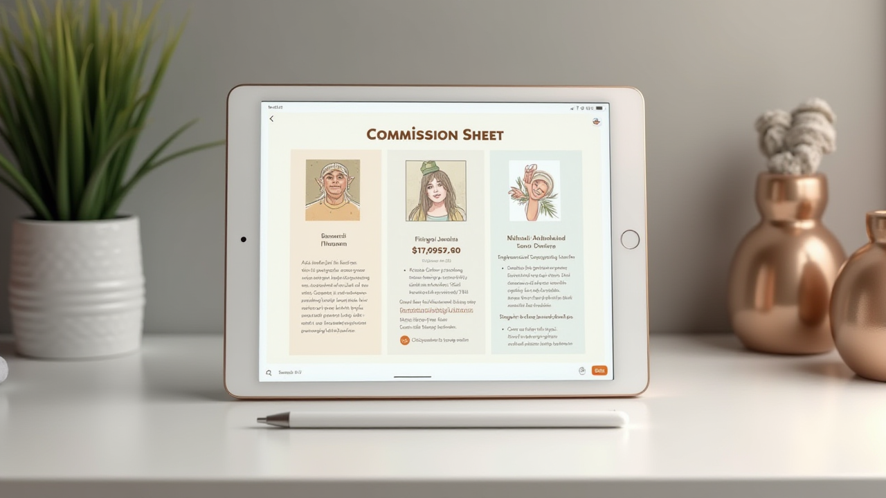
Studio Queues Team · Last updated August 25, 2026
How to make a commission sheet buyers can act on: what tiers to show, how to present prices, what to leave off, and where the sheet should send people next.
A commission sheet is the single image an artist posts to answer every question at once: what you offer, what it costs, what you will and will not draw. Done well it removes the awkward opening message where a buyer has to admit they do not know your prices. Done badly it is a beautiful file that nobody can read on a phone and no search engine can index.
This covers what goes on a commission sheet, how to present prices, what different formats look like, and the three things a sheet structurally cannot do no matter how well designed it is.
A commission sheet should show your tiers, prices, a visual example of each tier, what you will and will not draw, turnaround, and how payment works. Keep it readable at phone width, because that is where it will be seen. Understand its limits: text baked into an image cannot be resized cleanly, cannot be read by screen readers unless you repeat it in alt text, and is not indexable text for search. Treat the sheet as a poster that points at a real page rather than as the page itself.
The job is to let someone decide without talking to you. Every question a buyer would otherwise have to ask is a chance for them to decide it is too much effort, and the most common one is the price question, because asking it means admitting you might not be able to afford the answer.
A good commission sheet answers that question before it gets asked. That is its whole function, and it means the design priority is legibility rather than beauty. An artist's instinct is to make the sheet a portfolio piece. A buyer's need is to read it.
Worth knowing before you invest a weekend in one, because these are properties of the format rather than flaws in your execution.
It does not scale. The W3C's accessibility guidance on images of text notes that genuine text is much more flexible than images, since it can be resized without losing clarity and its colors can be modified to suit a reader's preferences, while images are more likely to distort and pixelate when resized. A sheet laid out at desktop width and viewed on a phone loses your price column first, because that is usually the smallest type on it.
It cannot be read aloud. Text inside an image is invisible to screen readers. W3C's images tutorial advises avoiding text in images where the image is not a logo, and says that when images of text are used, the text alternative should contain the same words that appear in the image. Almost no artist does this, which means a blind or low-vision buyer gets nothing from your sheet at all.
It is not searchable. Google's image documentation explains that it extracts information about an image's subject matter from the content of the page, including captions and image titles, and uses alt text along with computer vision and page contents to understand what the image is. Your prices, rendered as pixels, are not text that can rank. If you have wondered why a carefully made commission sheet never surfaces in search for the thing it advertises, that is why.
None of this means do not make one. People ask for sheets, they circulate well, and they are genuinely useful in a feed. It means the sheet is a poster, not a document.
Work in this order, because it matches the order a buyer's questions arrive in.
Your name and handle. Sheets get reposted and screenshotted away from your profile constantly. If your handle is not on the image, a repost is free advertising for nobody.
Tiers, with a visual example of each. The most common failure is listing tier names without showing them. Bust, half body, and full body mean different things to different artists, and a buyer cannot price-compare a word. One example image per tier does more than any amount of description.
The price for each tier. Visible, not "DM for pricing." A sheet without prices has failed at the one job that distinguishes it from a portfolio.
Add-ons, priced. Extra character, detailed background, commercial use, rush. These are where most disputes start, so name them explicitly.
What you will and will not draw. Short lists, plainly worded. This prevents the inquiry you have to decline, which costs both of you time.
Turnaround and payment structure. A rough timeframe and how payment is split. Buyers who have been burned before are looking specifically for this.
Where to go next. One link. Not four social handles.
Keep the type large enough that the whole thing survives being viewed at a third of its intended size. If you have to squint at a phone preview, so will everyone else.
Two problems with printing prices on an image. They date, and they are hard to change without redoing the file.
Some approaches that reduce the pain:
Show a starting price rather than a fixed one where complexity genuinely varies. "Full body from" is honest and leaves room for the piece that takes three times as long.
Keep add-ons additive rather than bundling. Separate line items are easier to update and easier for a buyer to reason about than five combination packages.
Date the sheet. A small "prices current as of" line means an old screenshot circulating a year later is visibly old rather than something a buyer will hold you to.
Do not put slot availability on it. This is the fastest way to make a commission sheet wrong. Open and closed status changes weekly. The image does not. Availability belongs on a page you can update, not baked into a file.
Deciding the actual numbers is a separate problem from displaying them, and it deserves its own thinking rather than being reverse-engineered from what fits on the layout.
The tier ladder. A vertical or horizontal strip of examples from smallest to largest offering, price under each. The most common format and the easiest to read. Works for anything with a clear size progression.
The menu. Categories in a grid rather than a progression, for artists offering distinct product types like emotes, badges, reference sheets, and illustrations. Each cell needs its own example image or it becomes a price list with no evidence.
The single-offer sheet. One product, one price, one large example. Underrated. If you mainly do one thing, a sheet advertising only that thing converts better than one implying you will do anything.
The YCH or slot-based sheet. Built around a specific pose or template with slots to claim. These are inherently time-limited, which makes them the one case where dating the image is not optional.
Across all four, the constraint is the same: every price needs a picture next to it.
Three habits that cost almost nothing and address the format's limits directly.
Write the sheet's contents into your alt text. Every platform supports it. This is exactly what W3C recommends for images of text, and it is the difference between a screen reader user being able to commission you and not.
Repeat the key details in the post caption. Tiers and starting prices as real text in the caption are readable, translatable, and indexable in a way the image is not.
Use a descriptive filename. Google's documentation notes that filenames give light clues about subject matter and recommends short descriptive names over generic ones. `chibi-commission-prices.png` costs you nothing over `sheet_final_v3.png`.
The structural fix for everything above is to treat the sheet as advertising and put the actual details somewhere made of real text that you can update.
That is what a Studio Queues profile does. Each offering carries its price, an estimated turnaround, a monthly slot limit, the intake questions you require, and how payment splits across milestones, and the page shows your current availability rather than whatever was true when you exported the image. Prices change in one place. Nothing needs re-exporting, and no outdated version keeps circulating.
The pairing that works: keep the commission sheet for the feed, where a single image is what gets seen and shared, and let it point at the profile for anyone who has decided they are interested. The sheet gets attention. The page handles the decision.
You can set up a profile and have the details answered before anyone messages you.
What size should a commission sheet be? Design it so it is readable when viewed at phone width, since that is where most people will see it. Test by looking at it on your own phone before posting rather than trusting how it looks on your monitor.
Should I put prices on the sheet or say DM for pricing? Put the prices on it. Hidden pricing filters out the buyers who were unsure they could afford you, which is most first-time commissioners.
How often should I remake it? Whenever your prices, tiers, or examples are no longer accurate. Dating the sheet reduces the urgency, because an old one is visibly old.
Do I still need a portfolio if I have a sheet? Yes. They answer different questions. The sheet says what you sell, and a portfolio that converts inquiries proves you can deliver it.
Where should I post it? Wherever your buyers are, pinned so it does not scroll away. Which platform your buyers are actually on covers the choice.
Can a commission sheet replace a terms of service? No. A sheet is a summary for a buyer deciding. Terms cover what happens when something goes wrong, and they need room a single image does not have.
Making a commission sheet is mostly an exercise in restraint. Show every tier with an example, put the price next to it, name what you will not draw, and give one link. Most sheets fail because they were designed to look impressive rather than to be read at a third of their size on a phone.
And be clear-eyed about the format. A commission sheet is an image, which means it does not resize cleanly, cannot be read aloud, and does not contain searchable text. Alt text and a caption fix two of those problems for free. The third is fixed by having a real page behind the image.
If you want the prices, timeline, and availability to live somewhere that updates instead of somewhere that expires, you can set up a Studio Queues profile and let the sheet do what it is good at. Founding artists get 0% platform fees active for as long as premium subscription stays active, first 500 spots only. Stripe processing fees still apply.