Studio Queues Team · Last updated June 8, 2026
Most commission disputes don't start during the work. They start before any pencil hits paper, in the gap between what the client pictured in their head and what they managed to put into words on the intake form. The client says "cyberpunk vibe, kind of moody," the artist hears "neon-soaked rainy alleyway in saturated purples," and the client meant "tactical near-future muted with a single accent color." Both of them think they're aligned. Three weeks later there's a finished piece neither of them wanted.
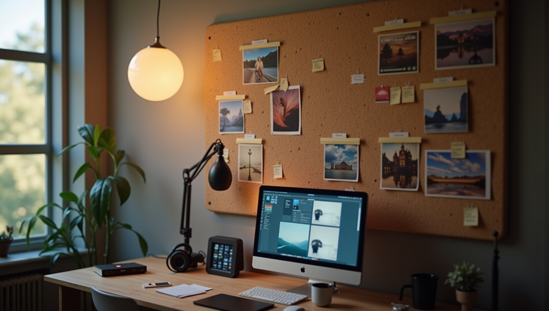
The fix is structural, not creative. It's a mood board, built collaboratively at the start of the project, that gets the visual specs locked down before significant work begins. Done well, the mood board is the most valuable hour of pre-production on the entire project. Done badly, it's a Pinterest dump that confirms nothing and creates new ambiguity.
This article covers how to actually use commission mood boards as a working tool: what to ask the client for, what to add yourself, how to organize the references so they answer questions instead of multiplying them, and the legal trap most artists never think about when a client sends in their references.
Most artists treat a mood board as "pictures the client likes." That framing misses the point. A mood board is a structured set of visual references that, together, define what the finished piece should look like across the specific dimensions that matter for this work.
The dimensions a mood board needs to nail down depend on what you're making, but typically include:
A good mood board has at least one reference that anchors each of these dimensions, and the references taken together should not contradict each other. A board with one image in saturated rainbow neon and another in muted earth tones is a board that hasn't actually settled on a palette; it's a board that's averaging two different commissions.
A useful mood board is not a flat grid of images. It has a structure that says what each image is for. The structure can be as simple as labels next to each image, or as formal as discrete sections.
The structure that works in practice:
1. Anchor image. One or two images that capture the overall feeling of the piece. Not images to copy, but images whose vibe the piece should share. The client usually picks these. Tag them clearly: "Overall vibe."
2. Color references. Images chosen specifically for their palette, even if the subject matter is unrelated. A photo of a sunset for warm dusk tones. A movie still for desaturated noir tones. Tag them: "Color reference."
3. Lighting references. Images chosen specifically for how light falls in them. A studio portrait for soft directional light. A street photo at golden hour. A nighttime image for dramatic contrast. Tag them: "Lighting."
4. Composition references. Images chosen for how the subject sits in the frame. A low-angle hero shot, a tight portrait crop, a wide environmental establishing shot. Tag them: "Composition."
5. Subject-specific references. Images of the actual subject (character, outfit, prop, environment) from the client's own materials. Existing character art they own, photos of the pet being portrayed, screenshots from a game the character is from. Tag them: "Subject."
6. Style references. Examples of finished work whose stylistic approach the piece should share. This is where the artist usually contributes the most, because the artist knows their own style and which examples from their own portfolio (or similar work) best match what the client is describing. Tag them: "Style direction."
Once the board is organized this way, ambiguity becomes much easier to spot. If the color reference and the lighting reference are pulling in different directions, that's an explicit conversation to have, not a buried contradiction the artist discovers halfway through the painting.
The intake form should not be the only place the client gets to describe what they want. Most clients are not visually fluent enough to specify a commission in words alone. They know what they want when they see it, and they often can't articulate it until they see it.
The intake form captures the basic specs (subject, tier, deadline, format). The mood board conversation is where the visual specs actually get nailed down.
The questions that work, in roughly this order:
"Send me three to five images of finished art whose overall vibe you want for this piece. They don't have to be by me; they can be from anywhere." This is the anchor question. The answers tell you what the client is actually picturing, often better than any verbal description would.
"Send me anything you have for the specific subject. Existing art of this character, photos of the pet, screenshots, character sheet, descriptions of what they wear." This captures the locked-in elements that can't be negotiated.
"What's the mood you want the piece to feel like in three words? Calm, energetic, moody, romantic, ominous, playful, defiant, etc." Short verbal anchors that you can hold up against the visual references to check for consistency.
"Are there any colors that absolutely need to be in this, and any colors that absolutely should not be in it?" Forces clarity on the palette without making the client design the palette themselves.
"Anything you've seen that's close to what you want but missing something specific? What's the missing piece?" This question often surfaces the most useful information, because it points at the gap between existing work and the client's actual vision.
What you don't do: ask the client to describe the piece in their own words from a blank slate. Most clients will write three vague sentences and you'll be no closer to knowing what they want. The references do the talking; the verbal context fills in gaps.
The board is collaborative. The artist adds references for the things the client typically can't articulate.
Examples from your own portfolio that match the brief. Saying "I'm thinking something in the direction of [this piece I did last year] and [this piece] but with [the energy of the client's anchor reference]" is more useful than the client's words alone. Your portfolio examples calibrate expectations to what you actually make.
Examples that show the polish level for the chosen tier. If the client picked a mid-tier commission, the mood board should include examples of finished work at that polish level, not your single most refined piece. The mood board is a calibration tool; if you only include your best work, the client expects your best work.
Specific reference images that fill gaps in the client's set. If the client's references all show character but none show lighting, you find or pick a lighting reference. If they have lighting but no color, you fill in color. Your job is to make the board complete across the dimensions that matter.
A clear annotation for what each image is contributing. Don't drop in an image without saying why it's there. "Adding this as a lighting reference for how harsh the rim light should be on the back of the head." The annotation makes the image actionable; without annotation it's just another picture in the pile.
Here's the section most articles on commission mood boards skip, and where artists quietly take on legal risk they don't realize they're taking on.
References are how every artist learns and works. Using references is not the same as copying. But "using a reference" and "creating a derivative work" sit on a continuum, and where you land depends on how closely your finished piece tracks the reference.
The U.S. Copyright Office's primer on copyright is clear on this: "Independent creation simply means that you create it yourself, without copying." A copyright owner has the exclusive right to "prepare derivative works based upon the work." That's a federal exclusive right, not a courtesy. If you create a piece that closely tracks another artist's existing work without permission, you may be creating an unauthorized derivative work, regardless of whether you call it "inspired by" or "referenced from."
This becomes a practical problem in commission work when the client's mood board includes images like:
These requests range from "legally fine if executed loosely" to "creating an unauthorized derivative work that infringes another artist's copyright." The line depends on how distinctive the original is, how closely your work tracks it, and whether your work is "substantially similar" to the original in the legally relevant sense.
What this means practically for mood boards:
When a client sends a mood board that's pulling in this direction, the move is not to ignore it and hope nothing happens. The move is to have the conversation:
"I love the energy of these references. I want to make sure I'm creating something original for you rather than recreating an existing piece. Let me use these as direction for vibe, lighting, and color, and let me build the actual composition and pose for your character from scratch. That way the finished piece is genuinely yours and doesn't risk stepping on the other artist's work."
Most clients respond well to this framing. The ones who don't are the ones who were knowingly asking you to copy, which is a client you didn't want anyway.
A note on the artist's own style: the boundary here is about copying specific works, not about studying style. Painting in a style influenced by Mucha or Sargent or Sakimichan is not infringement; recreating their specific pieces is. Style is not copyrightable; specific expressive choices in specific works are.
This isn't legal advice; it's pattern recognition for risks that come up. If a specific commission has you worried about copyright, talk to a lawyer who knows your jurisdiction. But for the routine case of "client sent references and one of them is asking too much," the conversation above usually resolves it.
Once the board is assembled, the review is a step, not a formality. Walk the client through it before any work starts.
The review covers:
This review is often the highest-value conversation in the entire project. It surfaces misalignments while they're cheap to fix. After the review, the board is locked: it's the spec for the piece, both parties have agreed to it, and significant deviations are scope changes.
If the project enters a revision phase and the client wants something different, the mood board is the document you return to. "The original board said warm and golden hour; the revision you're asking for is moody and blue. That's a meaningful shift from what we agreed to. We can do it, but it's a directional change rather than a tweak, so it counts as a major revision under the TOS." (Or however your terms define it.)
Without the mood board as a reference point, this conversation is "the client says I missed the vibe" vs. "the artist says they delivered what was asked." With the mood board, it's "we both agreed to this set of references, your current request is consistent or inconsistent with that set," and the conversation has a fact base.
This is one of the reasons the upfront board work pays back so heavily. The board isn't just for the first delivery; it's the spec the entire project is measured against, including any revisions or disputes.
Patterns that come up over and over:
Pinterest dump as mood board. Twenty unsorted images, no annotations, no structure. The artist has to do the structural work themselves and may guess wrong about what each image represents.
No anchor image. The board has color, lighting, and subject references but no image capturing overall vibe. The artist has to extrapolate the gestalt from individual elements, which is often where the misalignment happens.
Contradictory references. Three images of bright daylight and three of moody night, with no indication of which dominates. The board hasn't actually made a decision.
References that are out of reach. All the references are AAA-game-studio concept art, but the commission is at a tier that doesn't support that level of detail. The references set expectations the artist can't meet at the price.
Mood board built after work starts. Client sends references after the artist has already done the sketch, then wants the sketch to match the new references. The board has to exist before the work, not as a moving target alongside it.
No artist contribution to the board. Artist treats the board as the client's job alone. Client builds a board that misses key dimensions (no lighting, no composition direction) and the artist proceeds with gaps.
No formal review and lock. Board floats in a Discord channel, nobody confirms it's the final spec, and either party can later claim "I didn't agree to that one." Without an explicit lock-in moment, the board has no contractual weight.
A mood board is part of intake, not separate from it. The flow that works:
This sounds like more work than the typical "client sends some refs, artist starts sketching" approach. In practice it saves time, because the alternative is fixing misalignments mid-project, which is much more expensive than preventing them upfront.
The mood board is also the thing that lets the artist deliver more confidently. With a locked spec, the artist isn't guessing about the client's vision; they're executing against a documented agreement. The work moves faster because the decisions are already made.
StudioQueues has mood board collection built into the intake flow. The client uploads references at booking, the artist organizes and annotates them in the project workspace, both parties review and lock the board before the deposit milestone releases. The board lives with the project, not in a scattered Discord conversation. Founding artist spots include 0% platform fees for life, and there are only 500 of them.
Most commission misalignments are pre-production failures, not execution failures. The artist did good work; the client just wanted a different piece. The fix is to do the alignment work explicitly, before any drawing happens, in a structured mood board that both parties agree to.
A useful mood board is not pictures the client likes. It's a structured set of references organized by dimension (color, lighting, composition, vibe, subject, style), annotated so each image is doing a specific job, built collaboratively, reviewed and locked before work begins. It's an hour of upfront effort that prevents a week of rework later. The artists who do this consistently have fewer revisions, fewer disputes, and finished pieces that feel like hits because both sides agreed in advance what hitting looked like.